
Creative and eye-popping liveries part of the show at Indy 500
’Twas Mark Twain who said there is no such thing as a new idea. “We simply take a lot of old ideas and put them into a sort of mental kaleidoscope.”Note the colors of the IndyCar rainbow: When the field lines up for the 100th Indianapolis 500 on May 29, the mix of red, blue and probably even once-considered-unlucky green will showcase the history and creativity of the color schemes.

The goal: Make artwork out of machinery, make the cars as appealing to the cameras as to the eyes. Attract attention, highlight sponsors. Make liveries part of the show.
Indianapolis Motor Speedway has featured the orange models branded by STP, the splashy blue-and-gold Johnny Lightning Special that Al Unser won the 500 with in 1970 and ’71, the yellow Pennzoils reaching victory lane three times and all those iconic Marlboro schemes.
Because there are only so many ways to organize colors, it seems many of the best have been repeated. In this year’s race, Hélio Castroneves will use Pennzoil’s splendid all-yellow design for the second time (he also did in 2014) and Scott Dixon’s red Target car will have yellow lightning bolts similar to what Ganassi Racing used in winning four consecutive CART titles in the late 1990s and the 500 in 2000.
When Lotus returned to the IndyCar Series in 2012, its officials insisted on having a Jim Clark-inspired green-and-yellow car, and if it seems James Hinchcliffe’s UFD car in 2014 looked like another Canadian standout—both of Jacques Villeneuve’s entries, including the 500’s ’95 winner, were sponsored by Player’s Ltd.—that’s not a coincidence.

The blue-and-gold Johnny Lightning Special Al Unser won the 500 with in 1970-71.
“That might have been by creative design,” a laughing Hinchcliffe said of the link. “Maybe I was biased because (Villeneuve’s car) was pretty much done by Canadians, but at the same time, I’ve always thought it was simple and beautiful.”
STP’s support has always been unmistakable. Before Andy Granatelli introduced orange turbines and white pajama-like crew uniforms, Jim McElreath drove a car in ’64 with an oversized car number. Placed within the “28” were more than a dozen of the oval-shaped STP decals. Bobby Unser had a memorable STP car in that race, too. The orange Ferguson featured a silver midsection allowing the sponsor decals to pop.
Johnny Rutherford’s Chapparal, which won in 1980, wasn’t even the first of Pennzoil’s yellow productions. The year prior, Al Unser drove a similar model with the same scheme, although transmission failure caused him to finish 22nd. Such is the power of victory. It’s Rutherford’s submarine—plus the ’84 and ’88 wins of Rick Mears in that same livery—that will be remembered as Castroneves rolls off in May.
The Pennzoil scheme doesn’t even make for the most famous yellow car in 500 history; that distinction belongs to Ray Harroun’s Marmon. The black highlights supported the “Wasp’s” nickname.
Distinctive liveries are as old as the race itself. Mark Dill, a historian of U.S. racing’s earliest days, said the Indianapolis-based car manufacturers of the 500’s first decade differentiated their cars with specific colors. The Marions were red, the Marmons yellow, the Nationals indigo, and the teams were given sweaters to match. National drivers Johnny Aitken and Tom Kincaid were called “the Indigo Twins.”
“I’ve gotten the general impression the color palates back then were a bit more limited,” Dill said. “The (cars) were basically one color with some trim, but the colors (were) much more basic.”

Johnny Rutherford’s 1980 Pennezoil Special was a winner for “Lone Star J.R.”
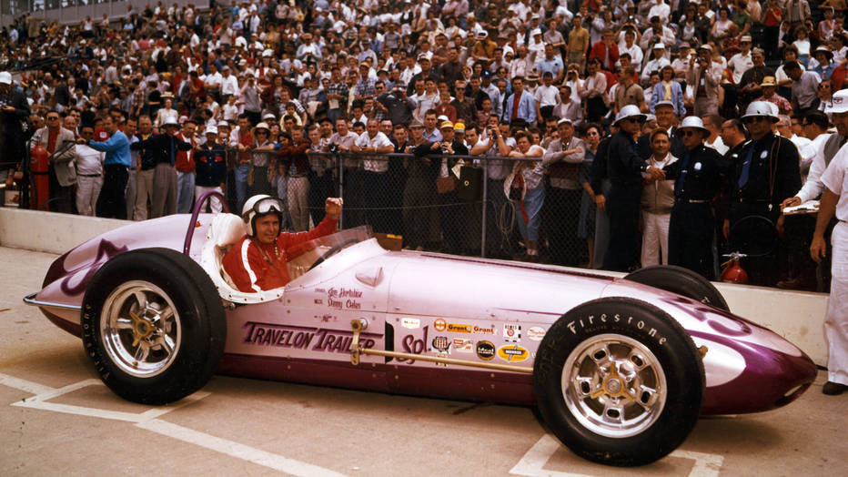
They weren’t pink cars like these first-time entries: Jim Hurtubise’s Watson roadster in ’60, the No. 90 Mears debuted with in ’77 (he didn’t make the show in Art Sugai’s Eagle) and Emerson Fittipaldi’s March that finished 32nd in ’84.
Not every design was as pleasing to the eye. For fun, seek out Roger McCluskey’s pea-green machine, a Kuzma design, from ’69. Being sponsored by Sprite allowed for some explanation, but the color, while
attention-grabbing, didn’t work. And if that weren’t enough, McCluskey had teammates. The cars of Wally Dallenbach and Mel Kenyon were similar in color.
Bobby Unser rolled out for the ’69 event in a Lola that missed its hue mark. Large purple and yellow squares didn’t make for a pleasing pattern. At least Al Miller’s car two years earlier—it was a Gerhardt—featured more compatible colors. Its squares were red and white.
George Snider’s Gerhardt in ’65 went with a light shade of purple with yellow trim. Ronnie Duman also had a Gerhardt, and it went unique, too: a purple body with a frontal splash of tan.
Any color can work, but singular black or white ones are susceptible to ineffectiveness when viewed from afar, and a pair of Eagles in the ’75 race illustrates the point. Jerry Karl’s dark car didn’t have enough color contrast to make it stand out; Dick Simon’s white machine had a funky number font that surely lost some of its zip on bright days.
Too bad Simon’s team couldn’t take a cue from John Mahler’s oversized but clearly visible numbers on his Eagle—but that livery wouldn’t appear until 1979.